Recently, I have been connecting with more and more educators around the use of Google Data Studio in schools. Google Data Studio (GDS) is a free resource from Google (of course). It allows users to create data visualizations through reports and dynamic dashboards. It was originally created as an advanced version of the Google Analytics tool used to monitor web traffic and users. GDS is now being used in many, many ways, including the field of education.
Internal & External Assessments
In my role as a Data & Innovation Specialist, I use GDS for many different purposes in school. We have been using GDS for the most obvious reason being to visualize and monitor academic data to improve student learning. We do this by triangulating both internal and external assessment data. Teachers use the interactive dashboards to identify certain groups of students so they can prepare for interventions and extensions. Click on the image below to be taken to a live example.
Student Profile Dashboard for Elementary School
Digital Placement Cards
We have also started using GDS for our digital placement cards. These cards were typically pieces of paper handed to teachers at the beginning of the school year. However, teachers needed to go through all of the individual pages. If there was any information they wanted to keep track of, they would have to create their own system. Through the use of the dashboard, we have been able to create reports for teachers with live, dynamic data. Much of the data comes directly from our Student Information System (SIS). As students join their class, their dashboard is updated automatically. You can see an example of that here.
Elementary School Student Placement Dashboard
Team Monitoring
As a member of a technology and innovation team in the elementary school, we wanted a way to check if the work we were doing was the right work. Were we spending the right amount of time on the right work? We developed a system to collect, analyze and visualize the things we do in school with our students and teachers by connecting Google Calendar, Google Sheets and Google Data Studio. With this data, we have been able to use this information as a starting point for discussions and as a way to reflect. The system for collection has not added anything extra to what we were already doing. The dashboard has helped us quickly see where we are spending our time and have conversations about making adjustments as needed.
Team Monitoring Dashboard using data from Google Calendar
GDS Course for Educators
Learning Google Data Studio can be a bit of a steep climb at first. You can really customize it to meet your needs and to showcase lots of different types of data. If you are looking for a way to learn about using Google Data Studio in an educational context, you can check out my course on the Team Monitoring Dashboard. Although this course is geared more towards an intermediate user of data and spreadsheets, I will guide you through the entire process, from start to finish. You can find out more about it here.
If you are an instructional coach, technology coach or data coach in a school or district, the following scenario might sound familiar to you.
In my role as a technology & innovation specialist I am the point person for 28 classroom teachers, 22 instructional assistants and 630 second grade and third grade students. In addition to this role, I also work with numerous administrative staff across the school as a data specialist. Because of the number of people I work with and my various roles, it is not surprising for me to not see some people for weeks on end. In the elementary technology office there are three other tech & innovation specialists who are in similar positions. Due to the nature of our role and the amount of people we interact with, we wanted to find a way to communicate, with transparency, exactly what we do.
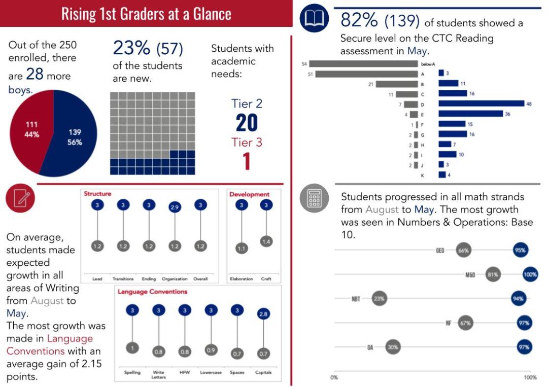
As teachers start out the school year, one of the first things on their mind is what type of class they will get. How are the students? Will they be high flyers? Will they need learning support? How many students will be new to the school? How many boys will I have compared to girls? Will I have any students coming in with known academic issues? Educational institutions, especially international schools, are able to answer these questions pretty easily, if they want to. We collect data on all this information. However, it is accessible to the people that want it or need it? What can we do to visualize this information so it is easily communicated at the right time to the right audience?
As a former classroom teacher, I would have loved to have this information available to me. After moving into the role of technology coach and data specialist, I decided to make this one of my first priorities. I wanted to build a one page “grade level at a glance” document for administrators and teachers to use to access information about the incoming cohort of students. At the beginning of the school year, this report was presented to the administration. They were able to get a quick glance at each grade level and do a simple comparison to get an idea of the overall make up of each grade level cohort. The administration agreed that this would be an ideal document to share with grade level leaders.
At our grade level leader meeting, teachers were excited to see the data. Right away, teachers were able to start having discussions about incoming students compared to last year’s students. They were quickly able to see what some potential needs would be with remediation and extension. Although they didn’t have the breakdown for their own specific class, as grade level leaders, they could get a pulse of the entire grade level very quickly.
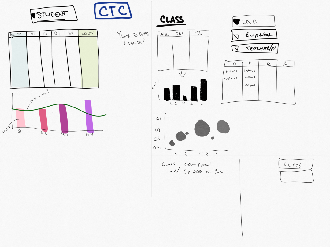
If this is something you would like to set up, there are a few things to keep in mind. The first thing is planning it out. Start analog with sketching. List out the items that you want to report on and start sketching variations of what this might look like.
Jot down ideas and elements for the report.
Experiment with sketching chart types
Start thinking about color and layout.
Consider fonts and other design elements.
Next, consider the layout. You’ll have to go through several iterations once you start building charts. This is is why you have done some sketching. Try to be consistent with colors and fonts in order to keep your overall look of your report consistent.
Once you have your sketches, you can then begin to clean and organize your data source. When trying to produce explanatory, static data, pivot tables come in handy for this type of work. For most data, you are likely looking at beginning of the year compared to end of the year. You might also be looking specifically at growth. If you have your data set up correctly you can easily find growth of an area by subtracting the end score from the beginning score. This can be done on a point scale or converted to a percentage, depending on the data.
Get feedback on the layouts and charts.
Show a few versions in order to get better feedback.
Don’t be afraid to completely change certain parts of the layout.
After your charts are built, try to do a few variations and get feedback from others on your charts. Feedback is critical. You want to make sure you get this from another person or a small group of people before sending it out to the wider audience. Remember that you know the data well, so you already know what the message is, your audience might not understand what you are trying to say. Getting feedback from others will help you clarify your message, making it stronger in the long run.
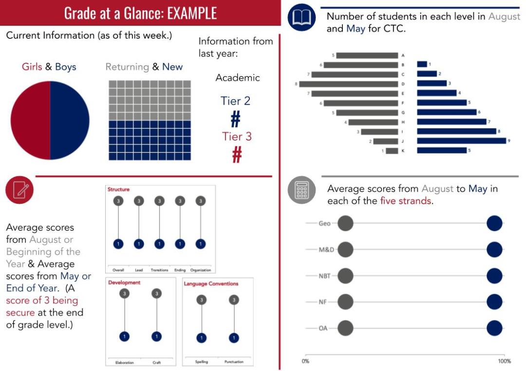
Example page explaining the contents of each section so the audience will understand what data they are examining.
When you have your final charts chosen, you could have a one page example that explains each section. Ideally, you want to be able to give your audience the charts and not have to explain what they mean. This is the ideal use of data visualization.
A follow up to my first NCTM blog post gives a concrete example from start to finish of an initiative that utilizes student learning data, protocols, and action. (more…)
Likely at your school, you have certain benchmark points in the year when you are collecting large amounts of data. You might collect Standardized test scores in the Fall, Winter, and Spring; you might have final exams at the end of the year; or you might have quarter and semester grades happening at specific intervals. (more…)