As a classroom teacher in an elementary school setting, we are responsible for knowing a lot about our students. Because we teach all subjects, we need to know how that student is doing in math, reading, writing, science, and social studies. We use many, many assessments to track this. Some assessments are done in the moment through exit slips or observations or they could also be just a daily check in. We might or might not record these observations. However, they add to the knowledge a teacher has about a student in a particular area or academically, overall.
When you’re a school faced with a crisis, gathering input is important. Opinions from your students, staff, parents, etc… can change and evolve over time and we need to be able to track them to be agile in improving our schools. The problem is, collecting survey data feels messy, particularly when we are gathering individuals’ unique perspectives. In response, we frequently adjust our surveys to make the analysis easier: restricting choices in a question or making the question somehow numeric (like a rating scale).
If you are an instructional coach, technology coach or data coach in a school or district, the following scenario might sound familiar to you.
In my role as a technology & innovation specialist I am the point person for 28 classroom teachers, 22 instructional assistants and 630 second grade and third grade students. In addition to this role, I also work with numerous administrative staff across the school as a data specialist. Because of the number of people I work with and my various roles, it is not surprising for me to not see some people for weeks on end. In the elementary technology office there are three other tech & innovation specialists who are in similar positions. Due to the nature of our role and the amount of people we interact with, we wanted to find a way to communicate, with transparency, exactly what we do.
When this all began, we wrote about Surveying Students to gain input into their experience as a distance learner. We simply wanted to know what was working and what was not; to be agile and change. But what if we missed something? How can we dig deeper and uncover some of the sentiment or emotional value that was offered in their responses? I am convinced, that we as educators must look back at this time and uncover the emotions of our students responses.
As teachers start out the school year, one of the first things on their mind is what type of class they will get. How are the students? Will they be high flyers? Will they need learning support? How many students will be new to the school? How many boys will I have compared to girls? Will I have any students coming in with known academic issues? Educational institutions, especially international schools, are able to answer these questions pretty easily, if they want to. We collect data on all this information. However, it is accessible to the people that want it or need it? What can we do to visualize this information so it is easily communicated at the right time to the right audience?
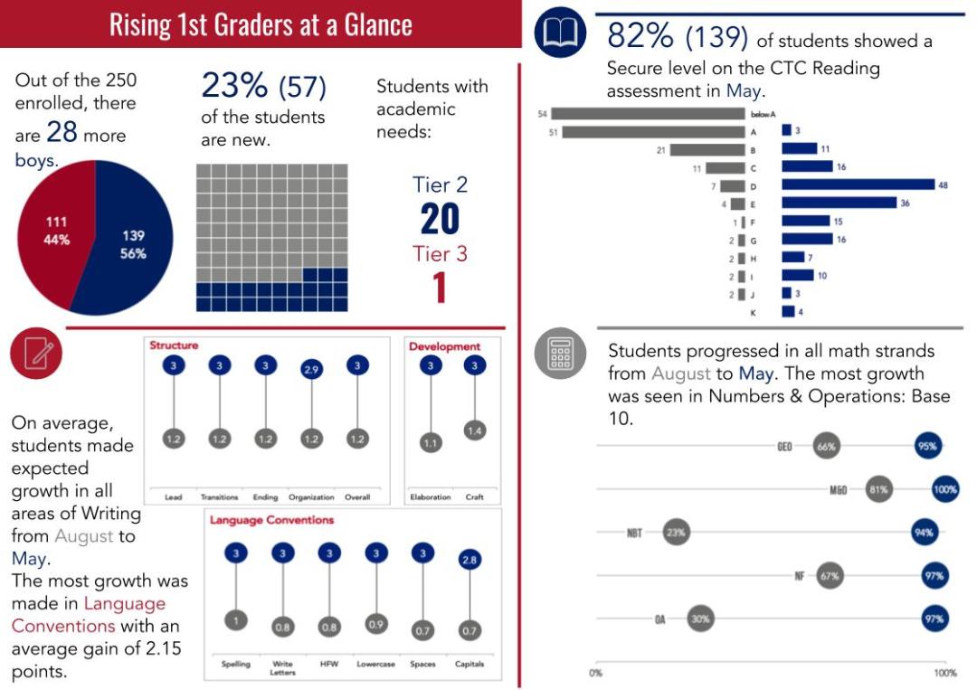
As a former classroom teacher, I would have loved to have this information available to me. After moving into the role of technology coach and data specialist, I decided to make this one of my first priorities. I wanted to build a one page “grade level at a glance” document for administrators and teachers to use to access information about the incoming cohort of students. At the beginning of the school year, this report was presented to the administration. They were able to get a quick glance at each grade level and do a simple comparison to get an idea of the overall make up of each grade level cohort. The administration agreed that this would be an ideal document to share with grade level leaders.
At our grade level leader meeting, teachers were excited to see the data. Right away, teachers were able to start having discussions about incoming students compared to last year’s students. They were quickly able to see what some potential needs would be with remediation and extension. Although they didn’t have the breakdown for their own specific class, as grade level leaders, they could get a pulse of the entire grade level very quickly.
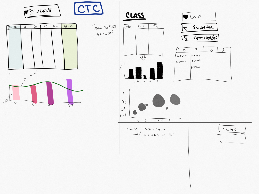
If this is something you would like to set up, there are a few things to keep in mind. The first thing is planning it out. Start analog with sketching. List out the items that you want to report on and start sketching variations of what this might look like.
Jot down ideas and elements for the report.
Experiment with sketching chart types
Start thinking about color and layout.
Consider fonts and other design elements.
Next, consider the layout. You’ll have to go through several iterations once you start building charts. This is is why you have done some sketching. Try to be consistent with colors and fonts in order to keep your overall look of your report consistent.
Once you have your sketches, you can then begin to clean and organize your data source. When trying to produce explanatory, static data, pivot tables come in handy for this type of work. For most data, you are likely looking at beginning of the year compared to end of the year. You might also be looking specifically at growth. If you have your data set up correctly you can easily find growth of an area by subtracting the end score from the beginning score. This can be done on a point scale or converted to a percentage, depending on the data.
Get feedback on the layouts and charts.
Show a few versions in order to get better feedback.
Don’t be afraid to completely change certain parts of the layout.
After your charts are built, try to do a few variations and get feedback from others on your charts. Feedback is critical. You want to make sure you get this from another person or a small group of people before sending it out to the wider audience. Remember that you know the data well, so you already know what the message is, your audience might not understand what you are trying to say. Getting feedback from others will help you clarify your message, making it stronger in the long run.
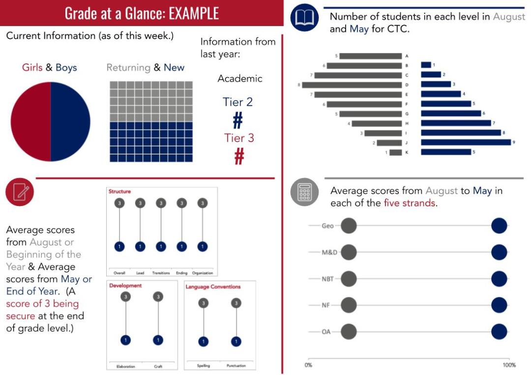
Example page explaining the contents of each section so the audience will understand what data they are examining.
When you have your final charts chosen, you could have a one page example that explains each section. Ideally, you want to be able to give your audience the charts and not have to explain what they mean. This is the ideal use of data visualization.
I believe that now more than ever, the argument that data plays a crucial role in eLearning has become obvious. But what data is most valuable? And how should we collect it? Here are 4 types of data I have been collecting that have helped me make decisions, be informed, and be creative with my practice.