

At the end of last year, I had presented what I had thought were beautiful and informative data reports, analyzing millions of data points across 9 years. I took my findings to my administration expecting that they might offer me praise, redefine or add a possible role for me, and give me some free lance duties as a data expert. However, the reaction I received was quite different.
I gave them my three most important graphical discoveries and every time I received little more than a smile. Being wonderful leaders, they praised me, but more in the way you praise an 8-year old describing the latest dance move they learned in their tap class. How could this be? How could there be such a disconnect?
It turns out, I was telling them the wrong story, overloading them rather than answering the question they were asking.
My best example: In one of my previous posts, I had discovered a general upward trend in the standardized test scores at our school. But with 8 lines represented, curving every which way, I only received glassy-eyed stares.
![DFmx %>% ggvis(~Date,~Diff.From.Norm) %>% group_by(Grade) %>% layer_model_predictions(model="loess",stroke=~factor(Grade)) %>% layer_paths(data=DFtmx[1:2,],x=~Date,y=~Diff.From.Norm,stroke:="red") %>% layer_paths(data=data2[3:4,],x=~Date,y=~Diff.From.Norm,stroke:="red") %>% layer_paths(data2=DFtmx[5:6,],x=~Date,y=~Diff.From.Norm,stroke:="red") %>% layer_paths(data2=DFtmx[7:8,],x=~Date,y=~Diff.From.Norm,stroke:="red")](https://visualizeyourlearning.files.wordpress.com/2015/06/screen-shot-2015-06-05-at-8-45-38-am.png)
What my administration needed to see was less data, less squiggles. This was an important lesson to know your audience and their data processing capacity. Simpler, is often better.
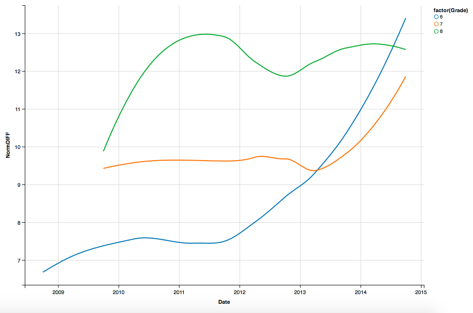
So for my Middle School administration, I simplified down to three lines for grades 6-8.
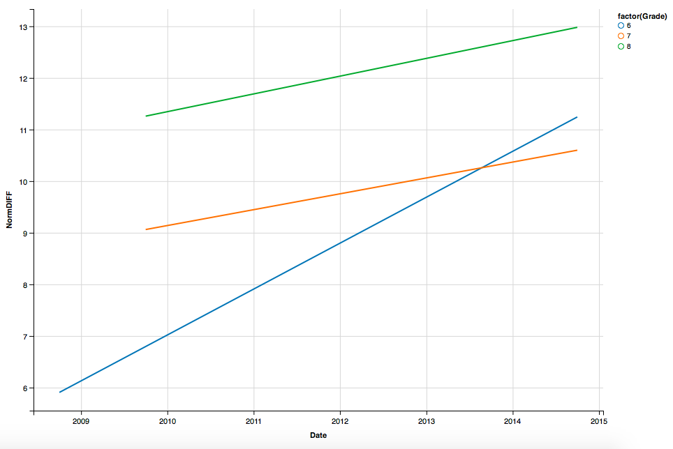
And then made a second graph, where the models are just linear regressions that they can use with our communities.
The result? Much more gratitude and they were much more impressed. I had answered a question that was in the back of their minds and gave them two models to work from. These models are now being prepared for presentations to share with other stakeholders.
Therein lies the major lesson for us all. A consumer of data should feel capable and empowered to share the result with others. Data is inspirational… but in the correct dosage.

Disclaimer: The data and graphics used on this site are simulated re-creations intended to protect the privacy of the original data sources.