

A novel builds character arcs before a climax; a comedian gives a setup before a punchline; and research papers place the results section before the discussions and conclusions section. It’s simple:
People make deeper connections when anticipation builds and finality is with-held.
The same can be said for a good data presentation. It should include moments to explore data without judgment, without theories of causality (I wrote about this a little bit in my post about building wonder). This requires a few key skills:
- Facilitate data meetings in a way that reminds people not to voice conclusions. You can do this through norms and protocols, or simply through silent exploration of the data.
- Have multiple visuals and tables in participants hands. Clean and accessible, pretty and elegant.
My new favorite is Interactive Graphs. This certainly wow’s participants, but I find I get way more activity and theories of causality if I give them something like this:
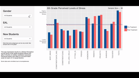
This interactive is the visualization of a Teacher’s pre/post-survey data measuring perceived levels of stress. The teacher can sort by subgroups, see summary lines, and create up to 27 combinations of factors.
An added benefit is that having numerous eyes playing with the different combinations allows us to discover even more story lines.
Another idea is this:
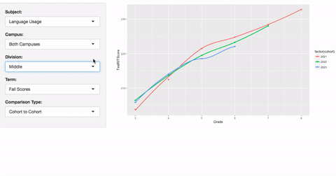
Crunching 10’s of thousands of historical data points for a standardized test and deploying on a schoolwide website (this one is still in draft). Imagine this as part of an in-house dashboard of data at the fingerprints of every teacher and administrator.
I guarantee a meeting with interactive data creates anticipation and pulls on the innate human desire to explore and discover conclusions for oneself.

Disclaimer: The data and graphics used on this site are simulated recreations intended to protect the privacy of the original data sources.