

For any educator that has been through an accreditation process, we are regularly asked: “How do your internal assessments correlate with your external assessments?” In simpler terms: “Do students who perform well on your in-class assessments also do well on standardized assessments?”
Anecdotally, all teachers will likely say “yes,” and they probably aren’t wrong. But there’s so much more to be discovered, such as How well do they correlate? Do certain assessments correlate better than others?
A little Data Science and Educational Data Mining comes to the rescue:
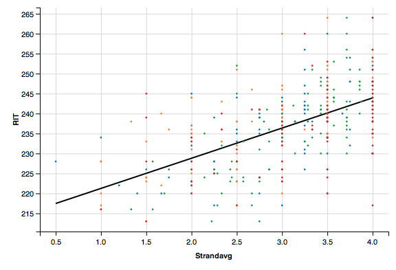
Lets start with the broad case of comparing overall assessment results to overall MAP results:
However, this might be a case of “underfitting”. We do have natural categories in MAP but we haven’t seen the correlations between categories. Let us go one step further and graph 4 lines corresponding to the 4 categories (or “Goals”) on the MAP test:
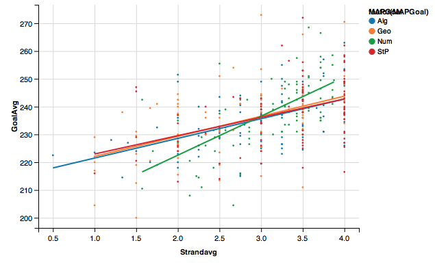 We now have a bit more information. All categories have strong correlations, but the teacher can use this graph to ask themselves: Why do my Number Sense assessments have the strongest correlations yet my Statistics assessments the weakest? What can I learn from my Number Sense assessments that I can employ in the others?
We can now use this information to develop even more consistent assessment and feedback procedures!

Disclaimer: The data and graphics used on this site are simulated re-creations intended to protect the privacy of the original data sources.