One question we’ve been wrestling with, every since we moved to Standards Based Grading is:
“How do we ensure consistency in our grading?”
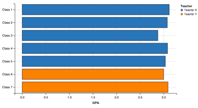
A possible and quick way to measure this is looking at the average grades of classes. We would hope they would be similar. So lets look at two teachers who teach the same class with common assessments and look at their average assessment scores at the end of the year. Hopefully they line up:
While most classes are close, it seems that Class 3 is possibly being under-scored in their assessments. However, we are assuming that all classes are created equal (which all teachers know is not the case). In data science, we call this “Over Fitting”. We have added too many categories and are now seeing an invalid result.
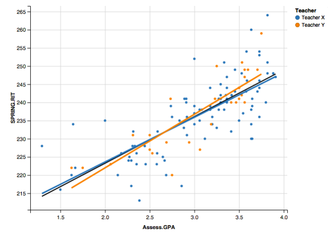
So lets regroup the kids and draw our graph in a different way with new variables and adding in external reliability measures. At our school, we use the MAPs in the Fall and Spring. If our teachers are truly consistent graders, we should see a strong positive correlation between a students academic grades and standardized test grades. Below is a multi-dimensional graph that has an x & y variable, linear models, and color codes:
 Here is a perfect example of the power of Data Science! We have “Teacher X” in blue and “Teacher Y” in orange. The dots represent individual students while the line represents the correlations with a linear model. The black line is a model of all the points, without taking into account the individual teacher.
The wonderful news here is that in one graph we can come to the following conclusions:
- Our students’ achievement on internal assessments has a strong correlation with achievement on external standardized testing – seen by the strong positive linear model
- Both teachers are consistent with each other – seen by how closely the two lines follow each other
- Both teachers are consistent with the group as a whole – seen by how both colored lines follow the black line
Be Careful With Your Data
If we would have stopped with the first graph, we might have drawn the wrong conclusion and thought we had a consistency problem, but instead, both of these teachers can feel validated on a successful year!

Disclaimer: The data and graphics used on this site are simulated re-creations intended to protect the privacy of the original data sources.


