

In the 1980’s and 1990’s, there was a push in the United States to have every student reach algebra by 8th grade. It was a political measure mostly to compete with the results of other countries. However, it seems that experiment has failed and now with the advent of the Common Core, they have explicitly warned against accelerating the progress of learning mathematics. Here’s what it says:
“…there are cautionary tales of pushing underprepared students into the first course of high school mathematics in the eighth grade… the NAEP scores of students taking Algebra I in the eighth grade varied widely, with the bottom ten percent scoring far below grade level. And… among students in the lowest quartile on achievement tests, those enrolled in higher-level mathematics had a slightly higher failure rate…”
Part of my plan is to re-create those two research studies at my school to see if we have similar results, however, our way to combat this disparity, is to make sure we’re very selective of the students going into our accelerated pathway. For us, this selection happens at the end of 6th grade. We use a combination of MAP scores, achievement on classroom assessments, dispositional rubrics, teacher observations, and student self-reflections in the process.
Lets take a look at the students who were selected for each of our courses and their MAP test results. Our “Math 7” course aligns with Common Core grade 7 and our “Pre Algebra” course is a compacting of grades 7 & 8 in preparation for Algebra 1 in 8th grade.
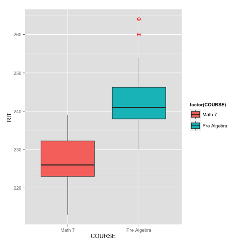
> ggplot(data, aes(COURSE,RIT)) + geom_boxplot(aes(fill=factor(COURSE)),outlier.colour=”red”)
By first glance everything looks okay. We have two boxplots showing what we would expect: that the MAP results should corroborate our selections. Indeed, quartiles 2-4 of the Pre-Algebra students is higher than virtually all students selected for the Math 7 course. But what about the overlap? It seems that Quartile 4 of the Math 7 kids is higher than quartile 1 of the Pre Algebra kids. Should some of those students switch places? Lets look closer:
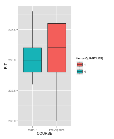
> ggplot(dataQ41, aes(COURSE,RIT)) + geom_boxplot(aes(fill=factor(QUANTILES)))
Here we have isolated just those quantiles. And they are incredibly similar with medians only 1 point apart. However, the group of students shown in these two boxplots are exactly the ones our department had conversations about. This is where dispositions, academic performance, self reflection, and observation came in. In any standardized test, we’ll have some overlap, but the MAPS is just one test on one day and we need to allow for some variance in our kids that fall in the middle.

> ggplot(data,aes(COURSE,RIT)) + geom_boxplot(aes(fill=factor(QUANTILES)),outlier.colour=”red”)
Our last Graph below is just another visualization of the data, but shows all 4 quartiles of both classes
This illustrates again that our measurements are corroborated by MAP results. Our top three quartiles are well outscoring all students in the “Math 7” course.
As to both of the points raised by the Common Core:
(1) Comparing bottom 10%-tile to grade level norms: The bottom 10%-tile of accelerated kids still score 230 and above. Grade level norms for MAPS is 225.6 thus our bottom 10%-tile of accelerated kids are outscoring norms rather than falling below them as the Common Core warned. However at our school, the norm is 235, thus our bottom 10%-tile are falling below our own grade level standard.
(2) Comparing bottom quartile to failure rates: For us, none of our students in the bottom quartile made it into the accelerated track, thus this concern can’t materialize.
Further work needs to be done to track these students as they follow the compacted/accelerated track, but we believe with a careful selection process, that neither of the Common Core’s concerns will apply.

Disclaimer: The data and graphics used on this site are simulated re-creations intended to protect the privacy of the original data sources.