

One way to build positive data culture is to give teachers powerful data when they need it most. Too often teachers feel that their opinions go unheard; but backed by quantitative data and visualizations, they become much more difficult to ignore.
Here’s a case study: A teacher wanted to help their students work on math fact fluency and found a fun web-based software to support learning. The program is game-based and the teacher noticed immediate engagement – students were asking to practice their math facts and the teacher anecdotally and formatively noticed improvements.
The downside? The $2000 price tag for a site license once the free trial ends.
This teacher had to go into a meeting and state their case. So I armed them with data!
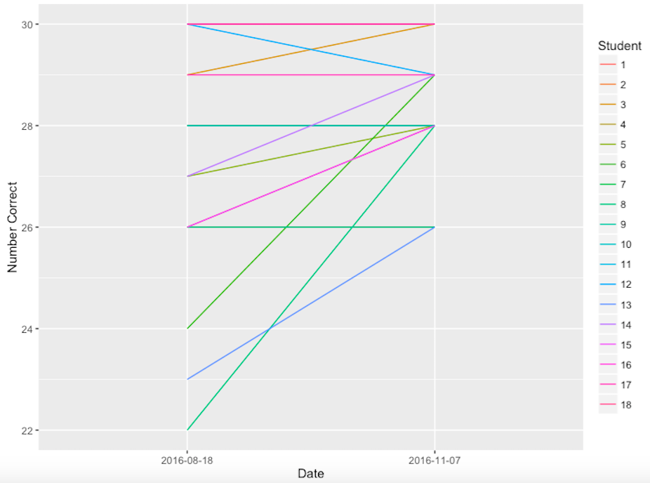
This pretty graph shows the progress of each student represented by a different colored line between a pre-assessment (on the left) and post assessment (on the right). It is hard to deny that a change has happened.
In August, you can see the range is 22-30 answers correct while in November, the range has been virtually cut in half. Out of 18 students, 12 have increased their scores (some dramatically), and 5 have stayed the same. The only decrease was a student who went from 30 correct to 29 correct – a normal fluctuation.
The picture above viscerally makes the case that the price tag (especially when spread out over multiple divisions) seem like a bargain!
I am often reminded of John Hattie’s Visible Learning study from 2015, which shows that the number one predictor of academic achievement is teacher perception. Teachers know their students and know what is working, yet we often doubt them.
Data can quiet the doubters.

Disclaimer: The data and graphics used on this site are simulated recreations intended to protect the privacy of the original data sources.