

The beauty of using a coding language like R or Python, is that you can customize virtually every aspect of your visualization. With an eye for design, you can portray loads of information in one graphic.
I challenge myself each time: How many variables can I show at once? How much of the experimental design can I show? How many story lines can one person see? And how can I make it all readable and beautiful?
So let me walk you through an example: I worked with a colleague to survey stress levels of 6th graders. We used Microsoft Forms to collect the frequency of stress on 13 known stressors. Here is the output Microsoft generates:
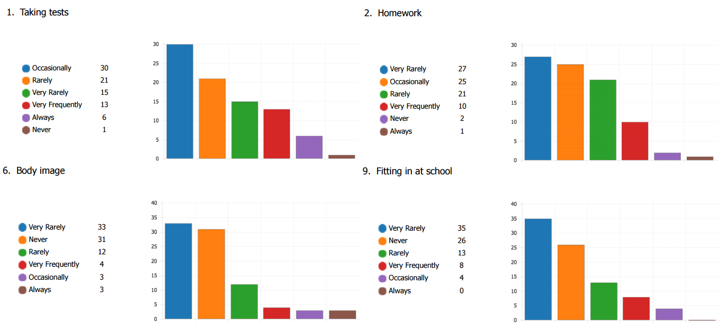
There is a lot that is difficult to digest here: The colors don’t represent specific responses, just position; the responses are ordered by frequency, giving a false positive skew; each question gets its own graph rather than seeing them together for comparison; there’s no calculation on central tendencies…
Ick.. so lets make it better with more features in one graph rather than less – which might sound counter intuitive.
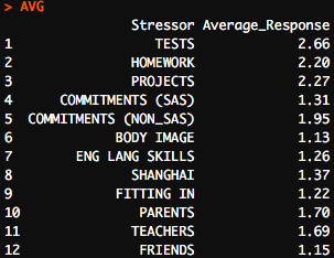
One of our first responsibilities is to reformat the raw data into a usable form. You can see I’ve built a table of numerics representing the average response for each question. Now, rather than over 1000 responses, we have 12 lines where we can already draw conclusions.
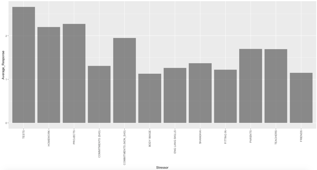
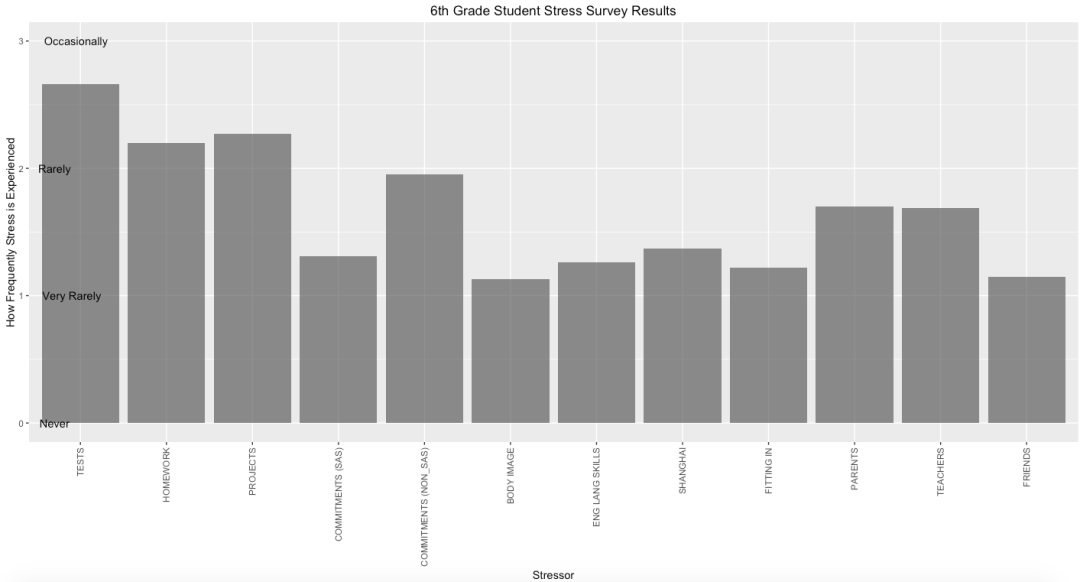
Then, I made my first graphic – a bar graph of these values. Even the simple plot below took 5 lines of code (after a 100 lines of cleaning the raw data)
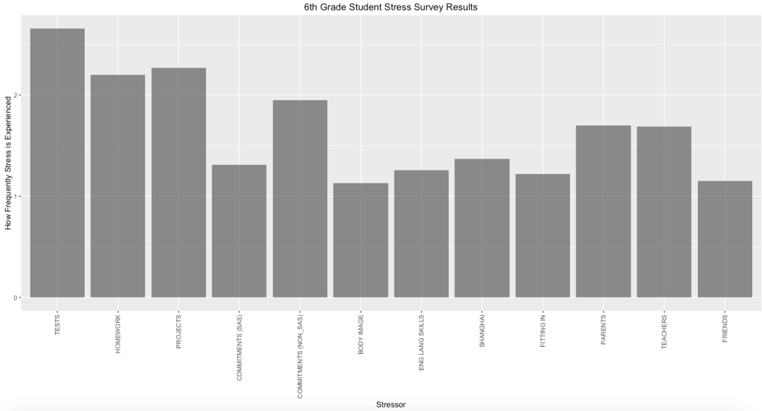
Next a simple addition: labels. With a title and a better y-axis label, you can now tell what and who the survey is measuring.
Adding on to our labels, we can modify the axis scales. In the beginning, I modified the x label to be rotated vertically, but now I modifed the y-scale to show the “Qualifiers” from the original survey.
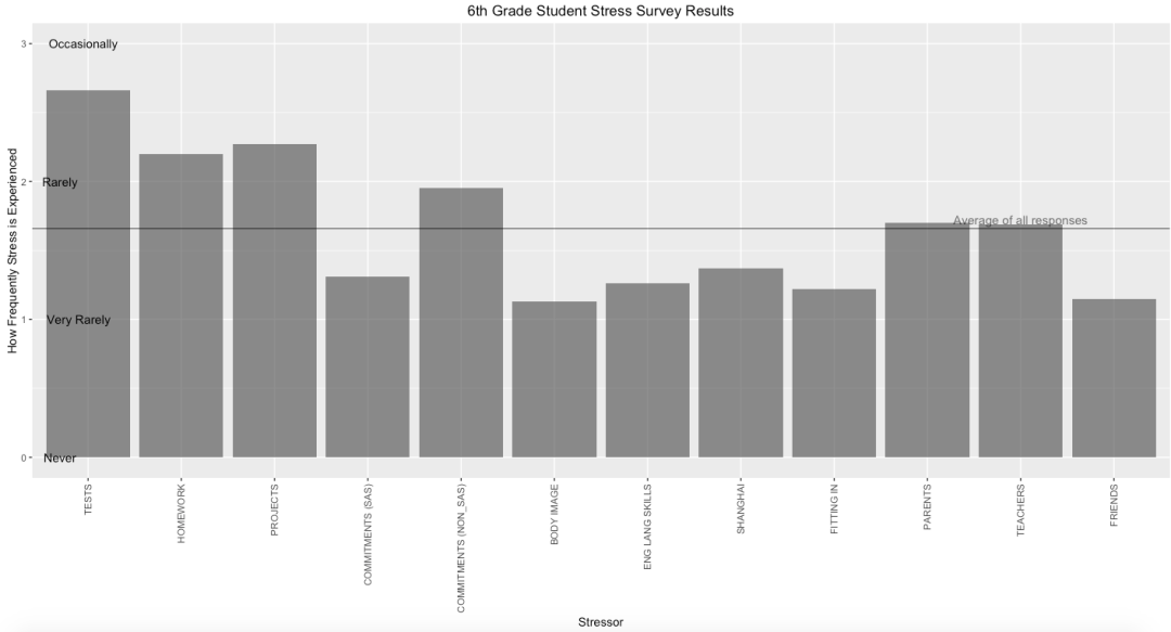
Next, we bring in more information by adding a horizontal line. Vertical and horizontal lines can show important moments in time or key benchmarks for comparison. In this case, the horizontal line is the average response across all questions.
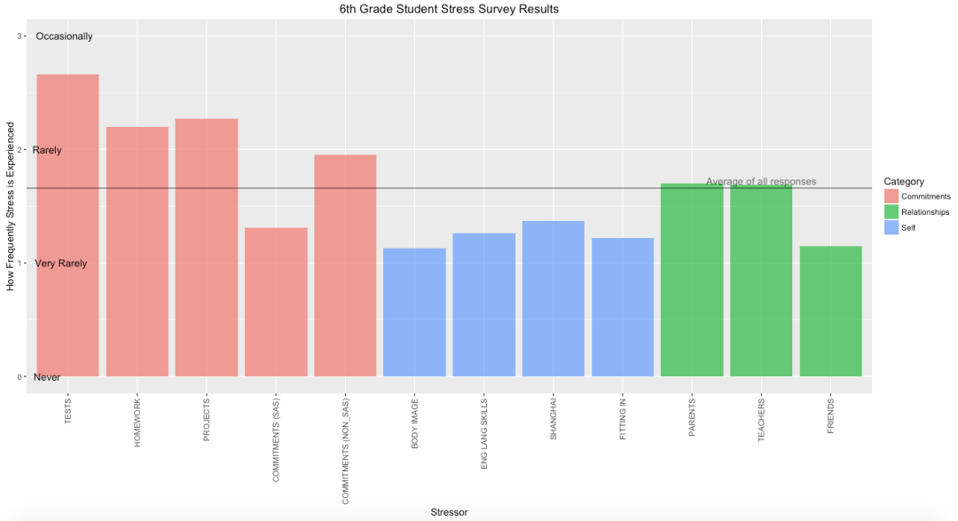
Lastly, bringing in color not only beautifies the aesthetics, but it can be used to show another variable. In this case, I’ve categorized each of the stressors as being related to “committments”, “relationships”, or “self”.
I’ve done a few other design tricks, like moving the horizontal line label to the right so it is not confused with the y-axis labels on the left.
Now, I’m confident that a reader could tell me what the survey was aiming to measure, even have an idea of how it measured participants and who it measured. We now can also use the best tool we have to start drawing numerous conclusions about data –
Our eyes.

Disclaimer: The data and graphics used on this site are simulated recreations intended to protect the privacy of the original data sources.