I got my hands on a beautiful dataset of 65,000 entries of standardized tests from 2008-present with 71 columns. We’re talking over 4.5 million data points! Time for my first analysis.
A neighboring school was noticing a trend that their students were performing better year after year and asked if we saw the same.
Here’s what I saw:
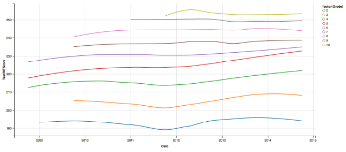
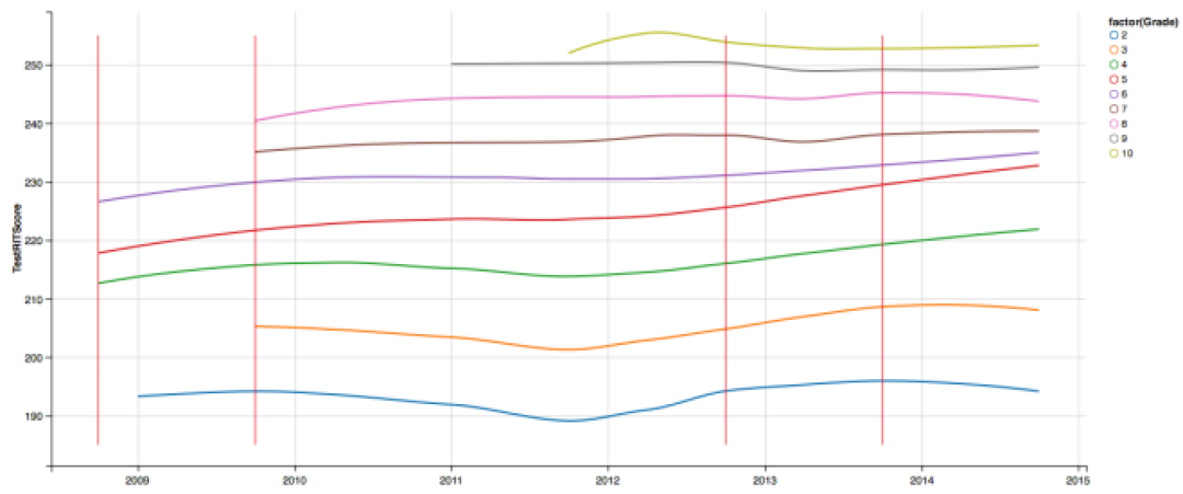
% ggvis(~Date,~TestRITScore) %>% group_by(Grade) %>% layer_model_predictions(model=”loess”,stroke=~factor(Grade)) ” width=”660″ height=”290″ /> Data %>% ggvis(~Date,~TestRITScore) %>% group_by(Grade) %>% layer_model_predictions(model=”loess”,stroke=~factor(Grade))
What we would expect to see each year is a “wiggle”. A fall score, then a higher spring score, then back down to the fall score norm and back up, etc… But we’re not seeing that at all, in fact, we’re seeing a slight upward trend in grades 2-6 since Fall 2011. What could be causing this? Are our kids getting better?
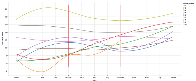
Well it could be that we changed tests every couple years. So below you’ll find the same graph with red vertical lines when we changed tests (note: all tests are MAP tests, but each change is a different version from NWEA V.4 to Common Core V.5)
Unfortunately this doesn’t tell us too much. I expected to see a new test line in Fall 2011, but that doesn’t seem to be the reason for the dip. I believe the reason instead is that our district changed locations and enrollment doubled and during that enrollment period, we got hundreds of new students who maybe were coming from different curriculums.
But one interesting thing to notice is that a change in test, didn’t seem to affect student performance. We have an increasing trend both before and after the Fall of 2011.
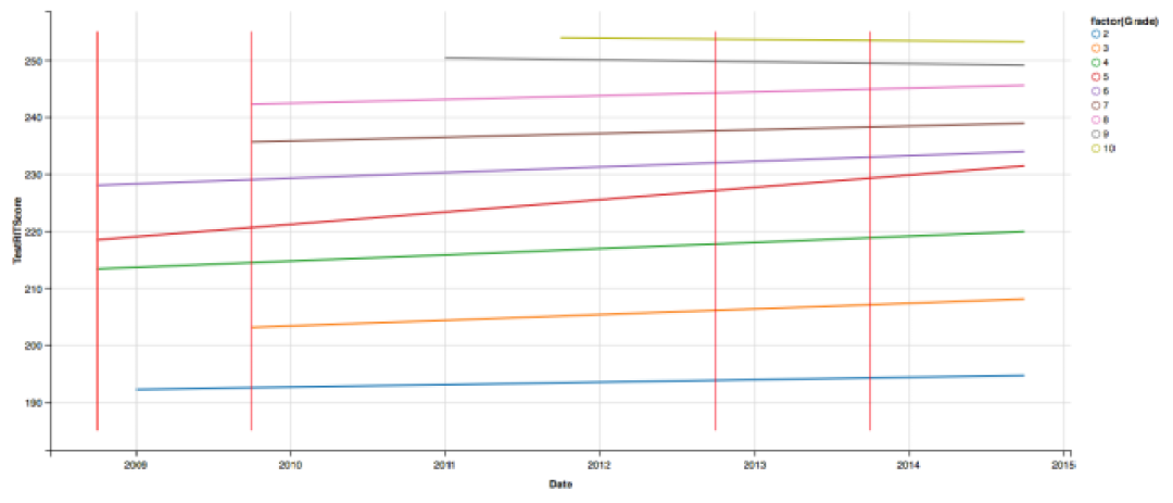
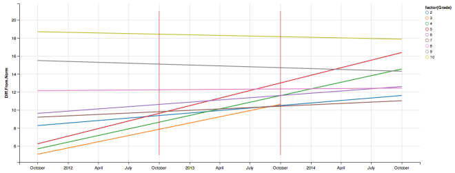
Lets simplify our predictive model to a linear model. If the upward trend is really happening, we should see it in the linear model as well.
We are seeing a mild increase in most grades except in grades 9 & 10. 10 is staying flat, which we would expect, but 9 has a slight decrease. Overall though, it’s an upward trend, and considering that it only takes around 6 point increase to be at a new gradelevel norm, these trends might be significant.
What if the testing is getting easier?
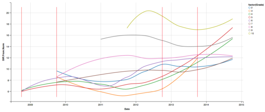
So instead of looking at our scores. Lets look at our difference from the norm with out curvy, loess-predictive model. This time you’ll notice the y-axis is measuring Diff.From.Norm
We’re seeing the same trends in our Differences From Norms variable. Since 2011, grades 2-8 have seen increases and all grades have seen increases since we changed to our latest version of the test.
Here’s a couple other interesting thoughts (I’ll let you draw your own conclusions):
- The order, from least to greatest, of grades that are outscoring the norm by the largest margin is: 3, 2, 7, 4, 6, 8, 5, 9, 10.
- Grade 5 outscored the Norm by the least amount in 2008, but now is third highest.
- Only Grades 9 & 10 have seen a decrease when looked at through the linear model, but in recent years are also increasing when you look at the loess-model.
So are we outscoring the norm by a greater margin as time goes on?
It seems so, but since we keep changing the test every couple years, it’s hard to accurately say a definitive “yes”.
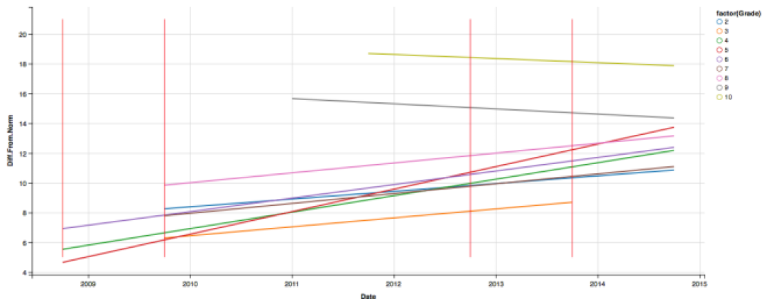
Lets look at just the data since 2011 when this trend seems to be really taking off.
The big takeaway here should be that all lines are quite a bit steeper on the upward trend (even grade 10 is now decreasing more slowly), except for grades 7-9 which seemed to be unaffected by the 2011 fall enrollment period.
Who should get credit for this growth?
We are an international school and faculty change all the time. As much as I’d like to take credit for my own grade’s growth over the time I’ve been here, I know I can’t as there isn’t enough longitudinal data, too many variables and too many curricular/faculty/policy/family shifts.
Plus, if it were caused by certain faculty or certain admin or certain policies, then you should see a sharp shift at the moment that those changes happened, but instead we’re seeing a general upward trend since 2011 with a bit of “wiggling” in all the grades.
If I were to take a bet on what the cause is… (completely unsubstantiated by evidence)
Time and student population. As our district has grown, the waiting list for families to get into our district has also grown. With that, we have become more choosy with who joins our community. I think we’ve benefited from having students and families enter our program who have already shown academic success in their other schools.
My only evidence for this is the dip in 2011 which perfectly aligns to the mass enrollment period when we virtually cleaned out our waiting list. We are going through another expansion in 2015, however we’re only adding about 30 new students per grade and have a waiting list nearing 1000. I’ve reviewed many of the files of our applicants and the large majority of them are already standardized testing rockstars.
I expect the trend to continue.

Disclaimer: The data and graphics used on this site are simulated re-creations intended to protect the privacy of the original data sources.


