

Surveying is a powerful tool for uncovering perception data. Whether it’s surveying your teachers for morale or efficacy perceptions, your community for satisfaction perceptions, or your students for their perceptions on their own learning, almost every school employs some form of perception survey.
We may argue about survey design, or over specific items in the survey, but I think the bigger problem is in the analysis and representation.
Specifically, when we do a one-off survey, none of our results are normed or aggregated over years of data. So while we might use qualifiers in our survey like “Agree” or “Disagree,” each person’s perception of the survey and those qualifying words will differ.
Take a look at this: We surveyed teachers to get a baseline of our climate at our school. The mistake is to do a traditional bar graph and to judge averages:
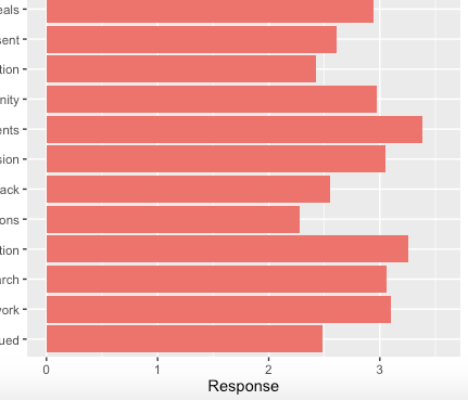
If our eyes are supposed to draw a conclusion here, we might be inclined to judge that climate is great (and it might be) and no further action is required. But these results haven’t been recorded year after year, so we don’t know trends, we don’t know normative data, we don’t know if scoring between 2 & 3 is a good thing or a bad thing.
(Another mistake, is that none of the responses equated to a score of zero. So technically our graph is inflated by 1-point already)
A quick fix: Instead, build your visualizations and analyzations on Difference From the Mean. A quick subtraction calculation. Check out the change:
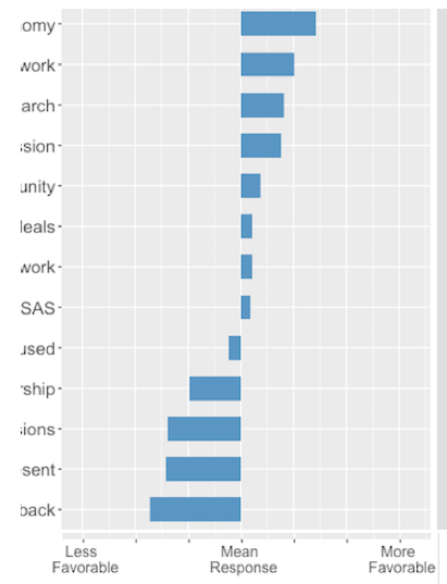
Now our eyes can quickly and efficiently tell the story. We have normed the questions against themselves in the absence of historical norms. I’ve even taken off the numbers at this point just to save some confusion and ordered the questions from most favorable to least.
The goal with visualizations is to allow the reader to immediately draw their inferences with their eyes. To digest the information quickly and move from data to action.

Disclaimer: The data and graphics used on this site are simulated recreations intended to protect the privacy of the original data sources.