If you are an instructional coach, technology coach or data coach in a school or district, the following scenario might sound familiar to you.
In my role as a technology & innovation specialist I am the point person for 28 classroom teachers, 22 instructional assistants and 630 second grade and third grade students. In addition to this role, I also work with numerous administrative staff across the school as a data specialist. Because of the number of people I work with and my various roles, it is not surprising for me to not see some people for weeks on end. In the elementary technology office there are three other tech & innovation specialists who are in similar positions. Due to the nature of our role and the amount of people we interact with, we wanted to find a way to communicate, with transparency, exactly what we do.
Over the course of one year, we decided to find out exactly what it is we do as a technology & innovation team. The first thing we did was to name exactly what we did. As we carried out tasks we created a brainstorming web on a large whiteboard in our office. At first, the web was very long and random. As time passed, patterns started to emerge. We notice how certain concepts and topics seemed to overlap. After a few months, we were getting to a point where we could categorize tasks into larger buckets. Once we had these main categories, it was a matter of making sure the things we did would fit into one of those. If it didn’t, we adjusted.
Brainstorming
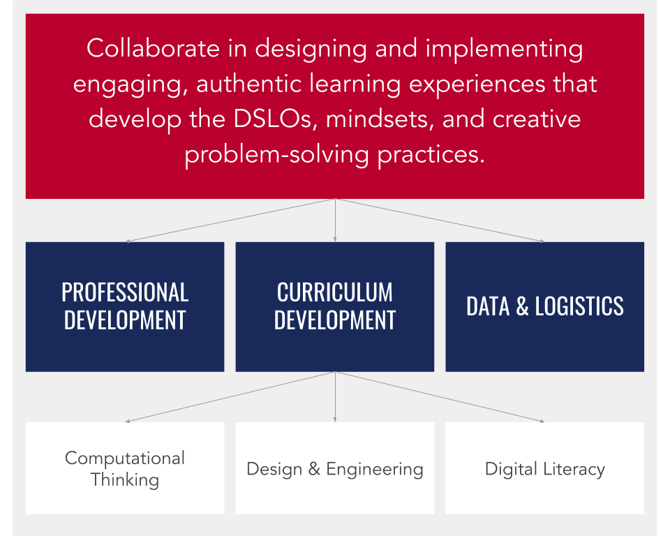
After about six months of brainstorming and categorizing, we then moved on to defining each of the categories. We went anywhere from fifteen all the way down to two categories. Those two happened to be “people facing” and “behind the scenes.” This was a bit too broad. We ended up settling on the following categories:
- (CDI) Curriculum Development and Implementation: Engage in designing of learning experiences that facilitate the meaningful and authentic integration of the following:
- (CPT) Computational Thinking: Problem-solving methods that often, but not always, involve computing, coding and robotics
- (DEN) Design and Engineering: Creative processes to identify and solve a problem through the development of solutions
- (DGL) Digital Literacy: Ability to navigate in a digital world
- (PFL) Professional Learning: Preparing our staff through learning opportunities that expose them to new teaching approaches
- (DTL) Data and Logistics: Organizing and making sense of the information we collect to help guide instruction; ensuring our devices, software, subscriptions, testing environments, and networks are functioning as expected
- (PLC) Professional Learning Community: Working collaboratively with grade level colleagues to plan, prepare, and reflect on best educational practices
Tracking
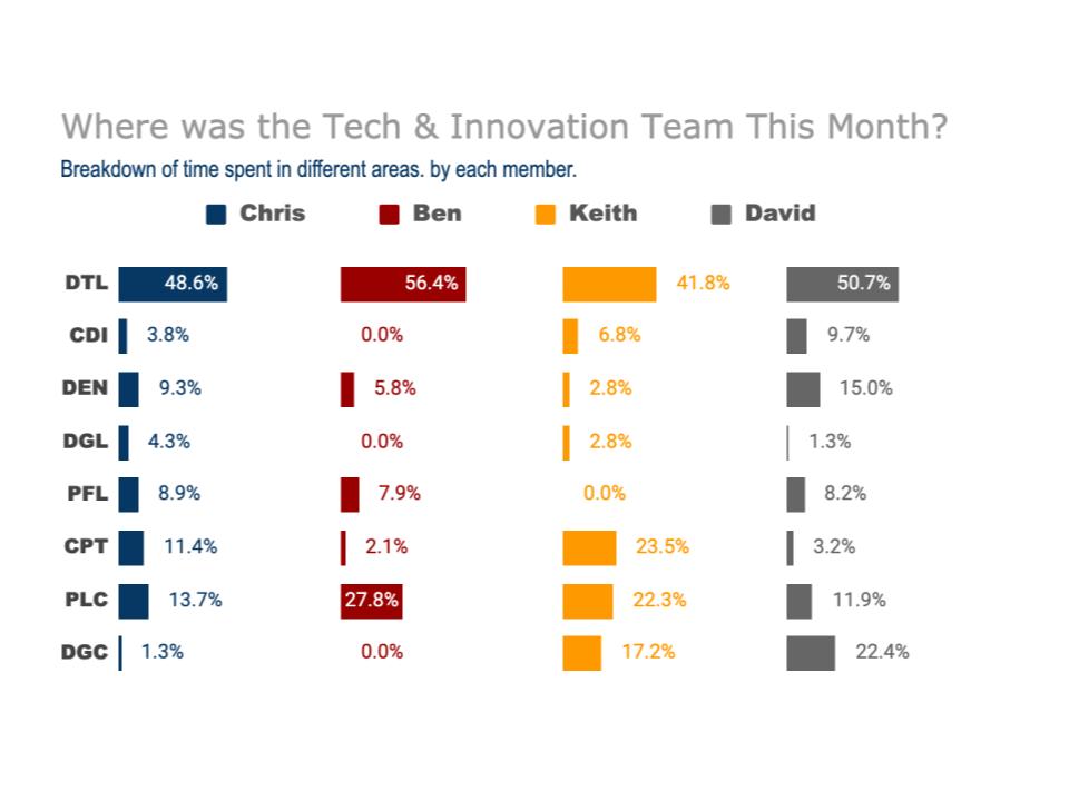
Now that we had decided what we did, we had to come up with a way to capture it. We wanted to know exactly what percentage of our time we were spending in each of these key areas. We needed a system for this. Each of us had Google calendars that we scheduled some events with teachers and classes. We decided to be more deliberate with our work and schedule everything. In addition to scheduling, we would also tag each event in our calendars. If we were in a PLC meeting, we would be sure to add the tag “PLC” to the event. If we were working on robotics with a class, we would tag it as “CPT” for computational thinking.
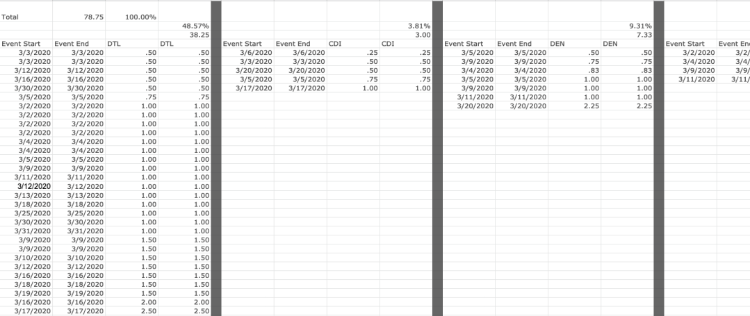
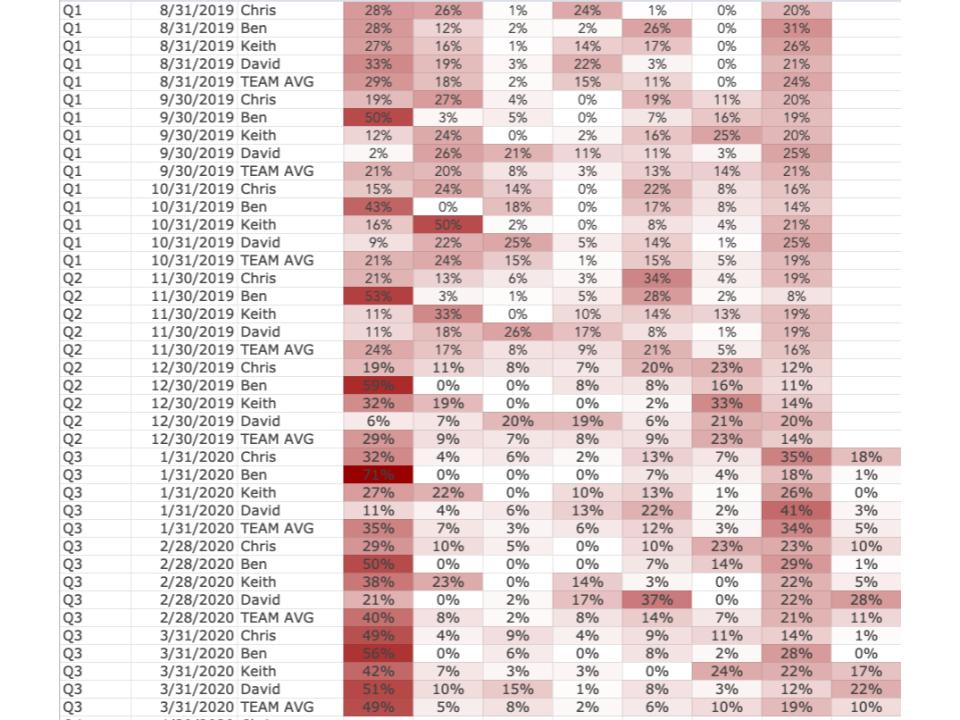
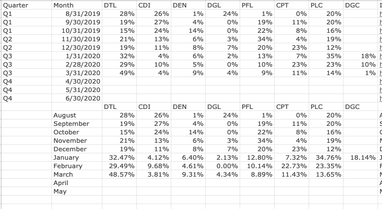
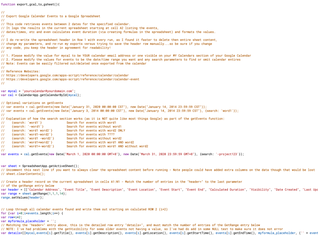
Through the use of some spreadsheet magic and an API script, I was able to create a system that collected all of the calendar events from each of the four people in the office on a monthly basis. The events were added to a spreadsheet which calculated the time spent in each category for each person as well as an overall team average. Once the data was collected, it was just a matter of visualizing the information for the team and for others.
Communicating
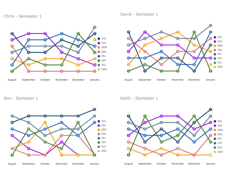
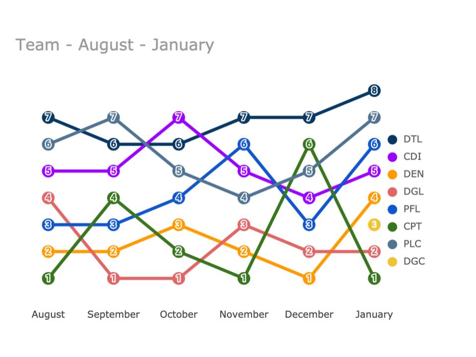
At first, I decided to leverage the charts tool available in Google Sheets. I was able to make some basic dynamic charts that would update with new data each month. At first, these charts were used to just show what we were doing in a visual. However, after the first month, we soon started to notice trends in our work. The charts also helped us form conversations about where we were spending our time, if it seemed reasonable, and perhaps where we needed to make a shift. Although the charts we had changed every month, they were pretty limited in the information we could see and how we could see it. In addition to this, as time went on, we wanted to be able to share this with the larger school community.
I decided to take our data and import it into Google Data Studio (GDS). Google Data Studio is a free platform mainly used for marketing and business data analytics. It is pretty robust and it does have a steep learning curve. The cool thing about GDS is the ability to explore data. With a spreadsheet, it is sometimes possible for someone to accidentally delete formulas or mess things up. The beauty of GDS is that multiple people can be exploring the same data at the same time, but in their own way. And, they can’t mess it up. GDS links directly with many sources, including Google Sheets. As the spreadsheet is updated or new information is entered, the GDS dashboard will also update dynamically. This way, anyone on our team, or anyone in the school with the link can go on and explore the data whenever they want.

If you are interested in getting started with a similar process for your team, please feel free to reach out to me for more information. I’d be happy to help you with the exact same template I use or we can work together to develop one that suites your needs.


